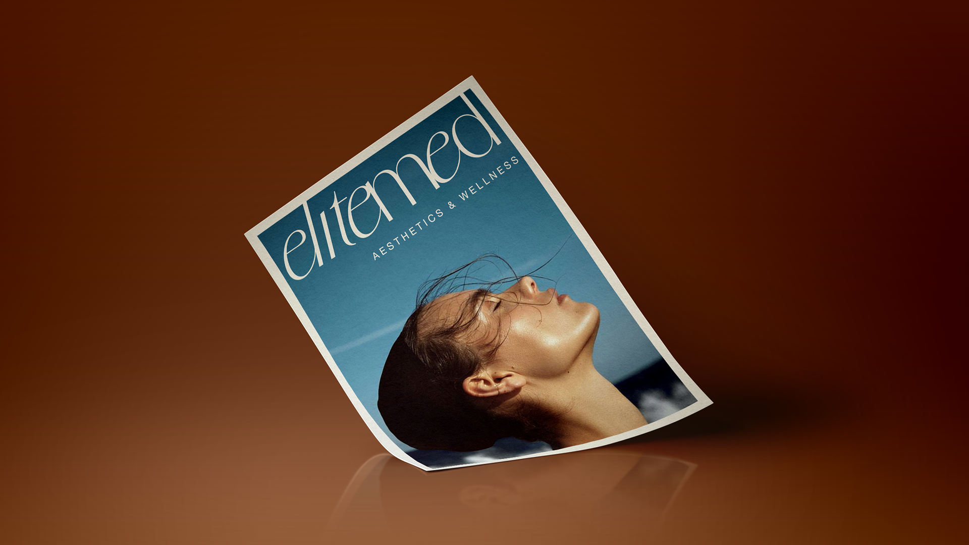
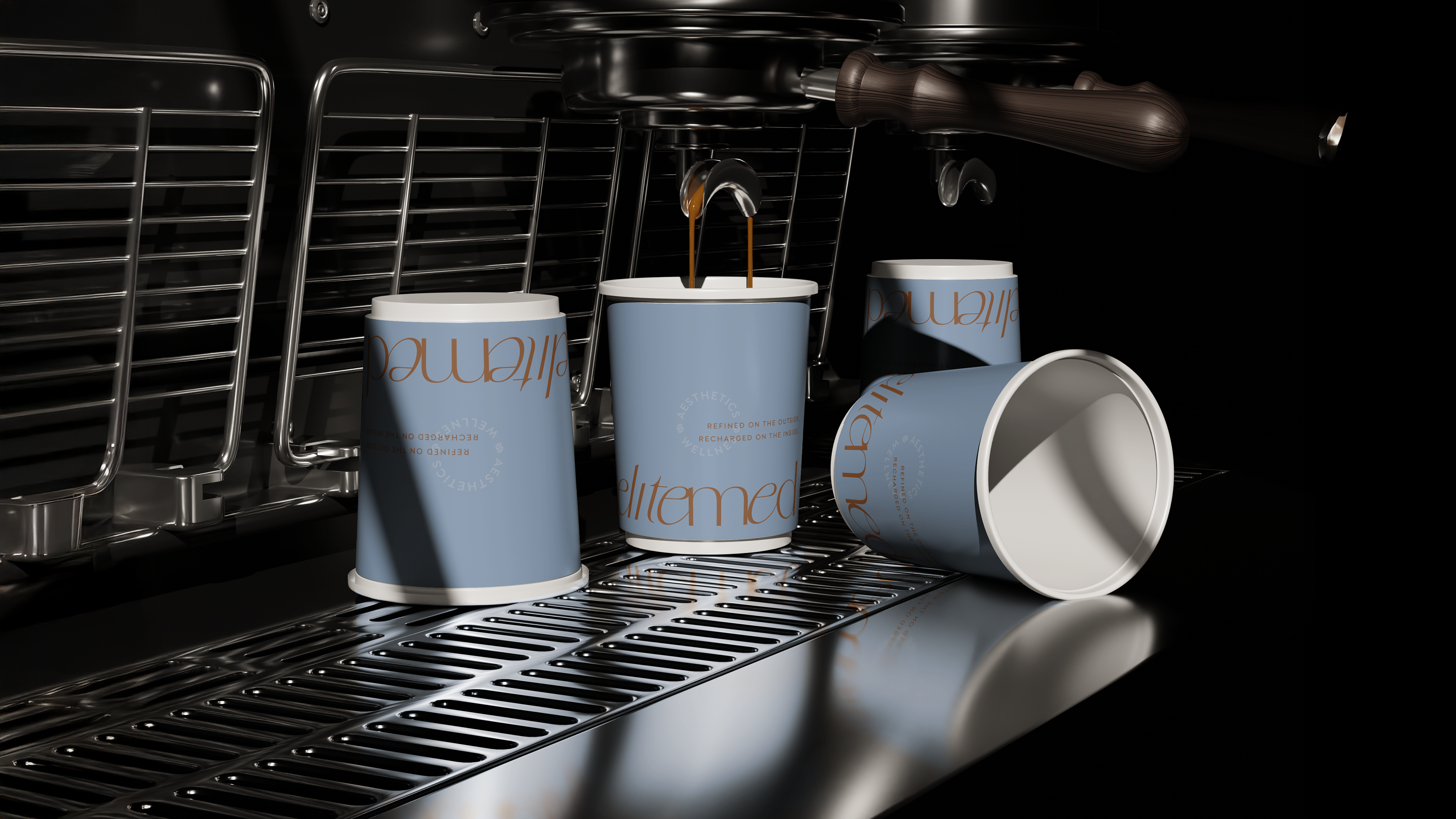
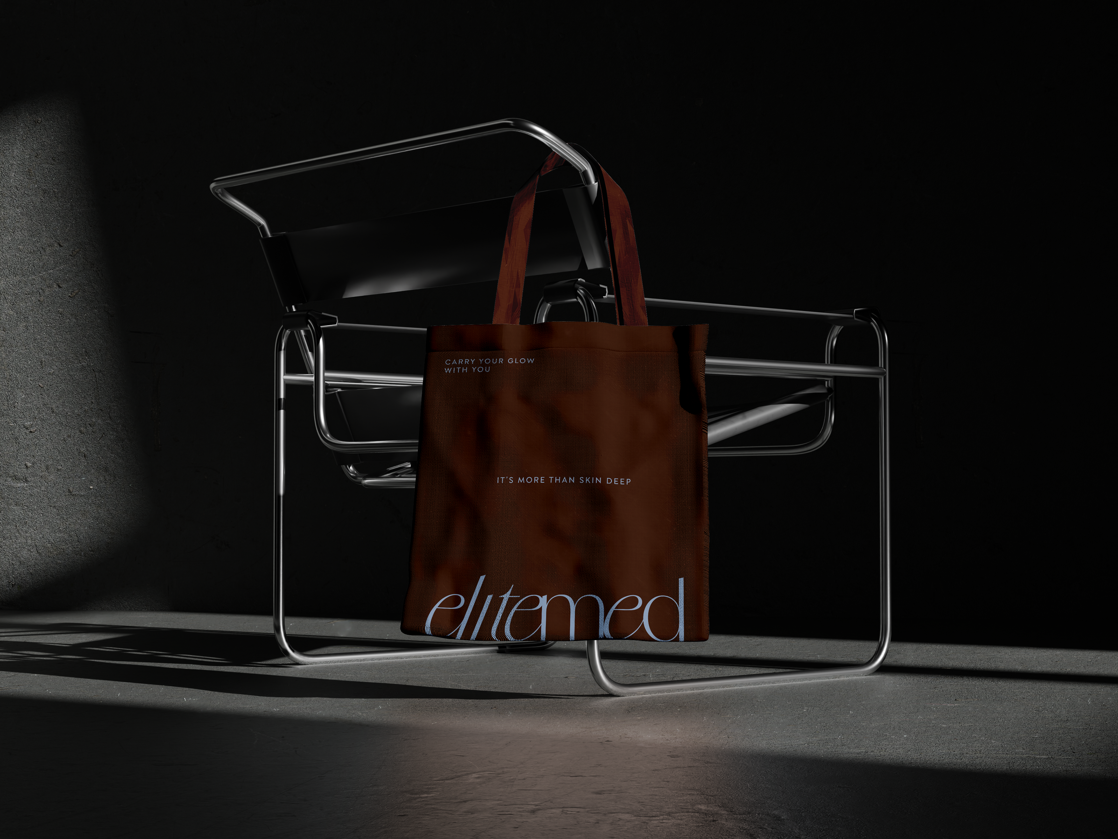

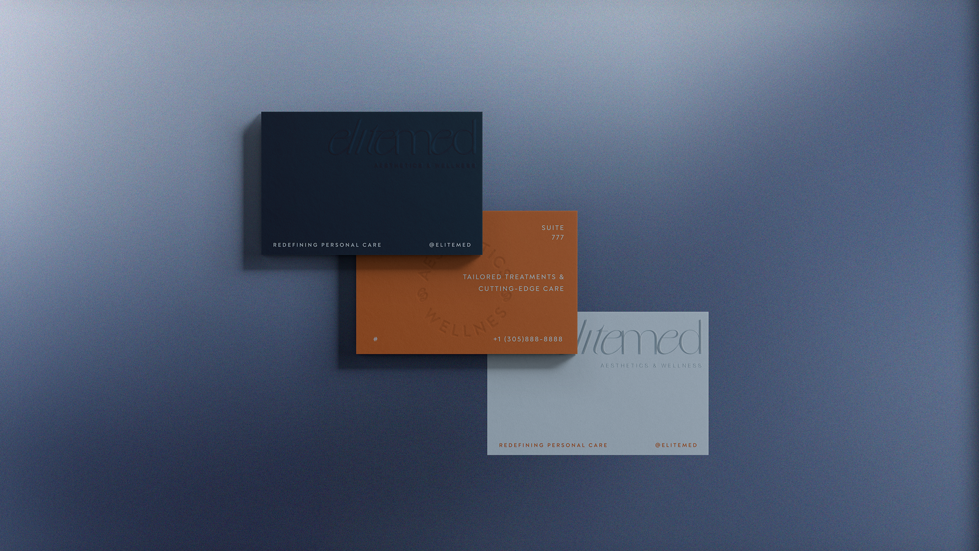
For Elitemed, the vision was to create a brand identity that felt elevated, clinical, and intentional while still remaining approachable. The goal was to position the brand at the intersection of aesthetics and wellness, balancing trust and expertise with a sense of ease and refinement.
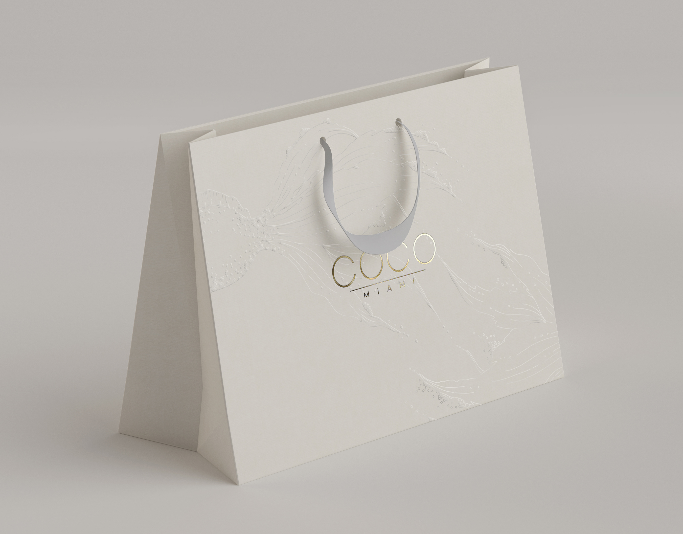
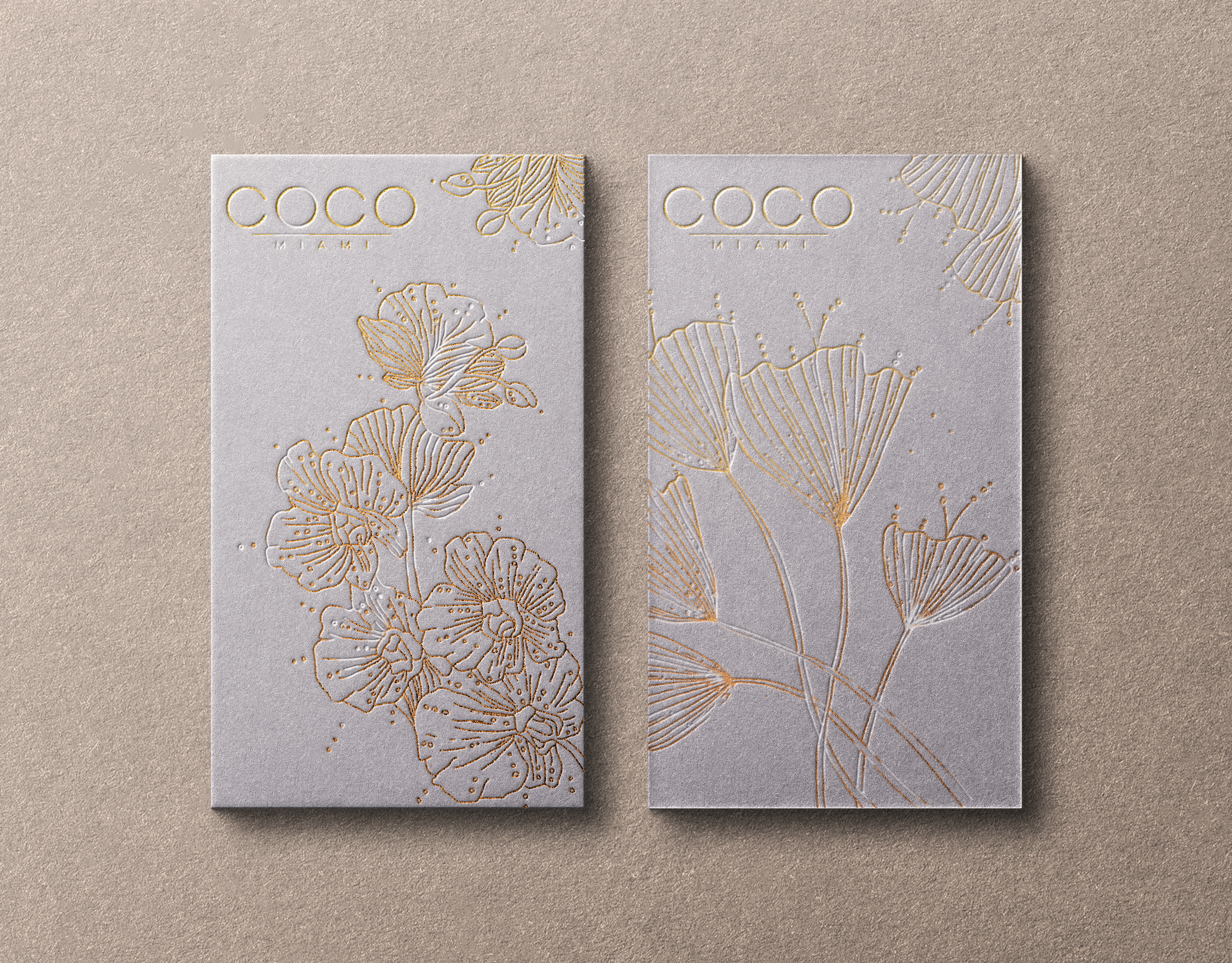
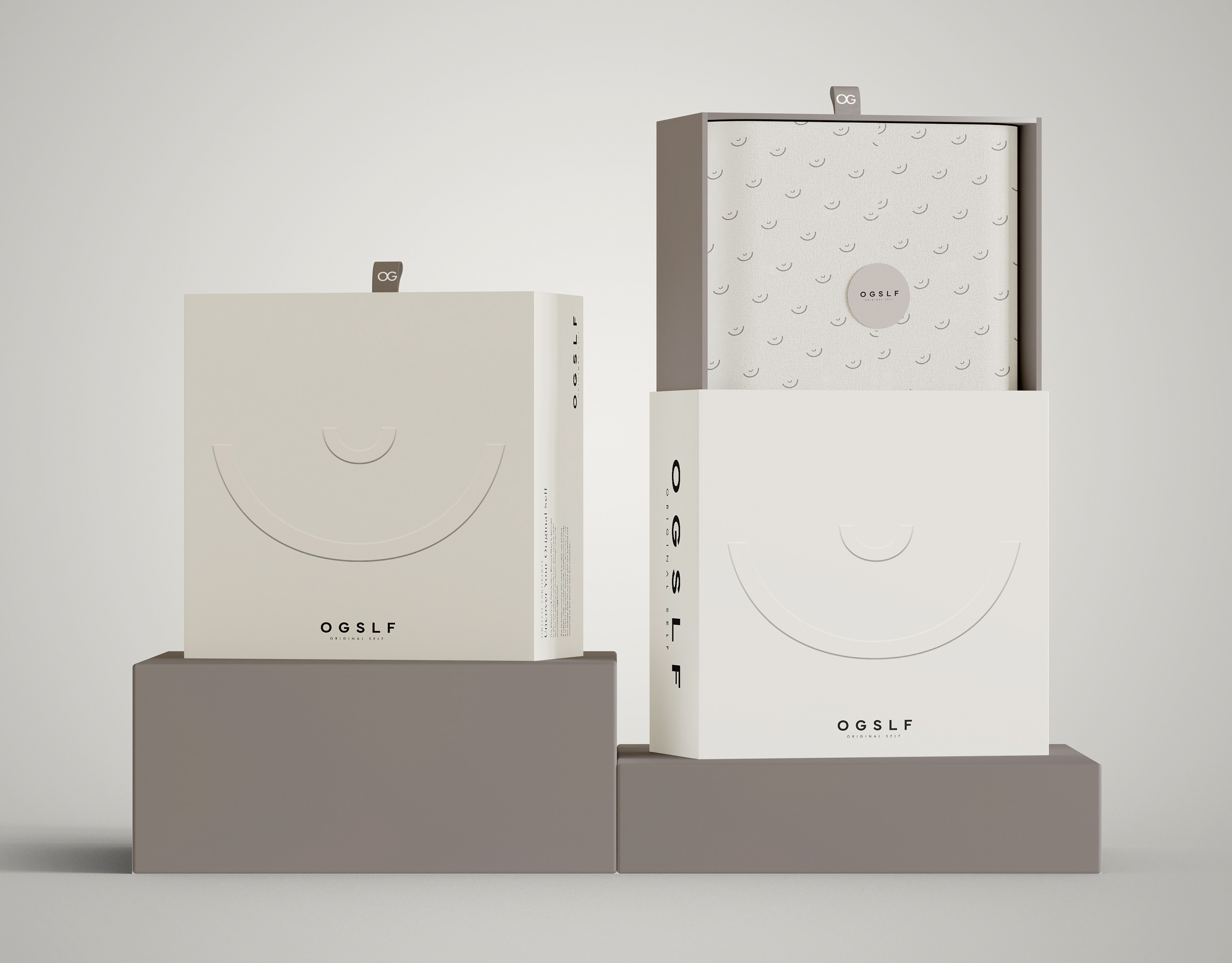
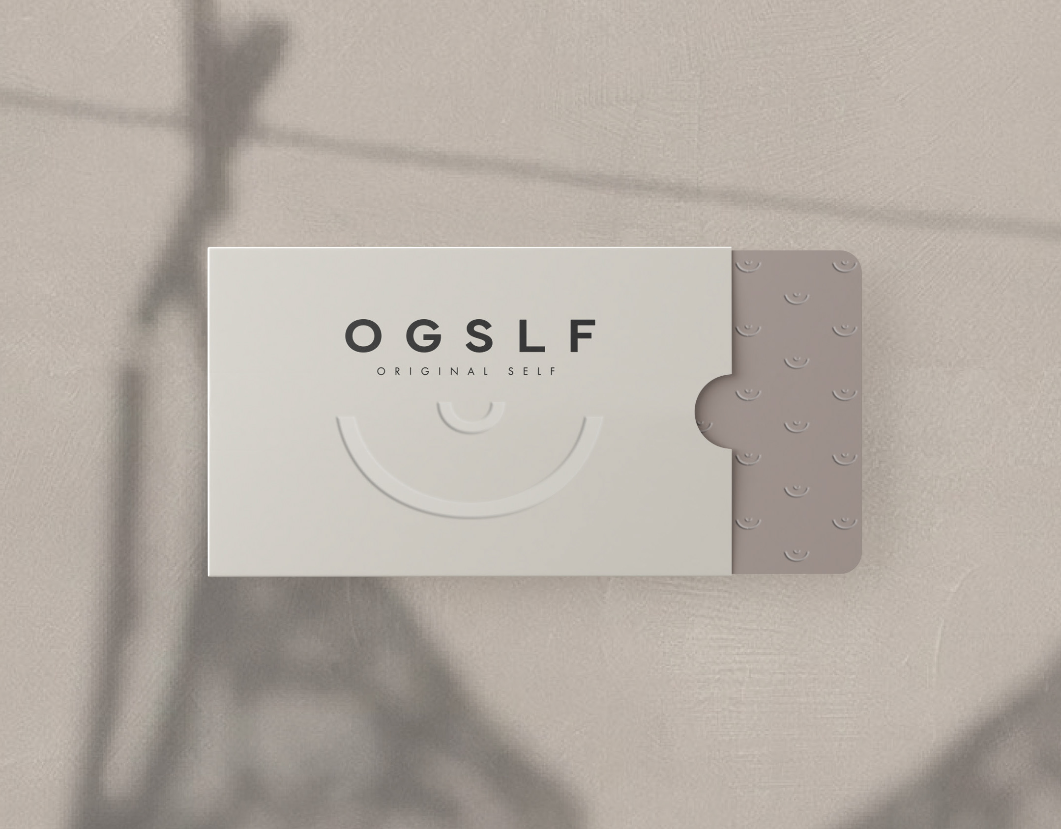
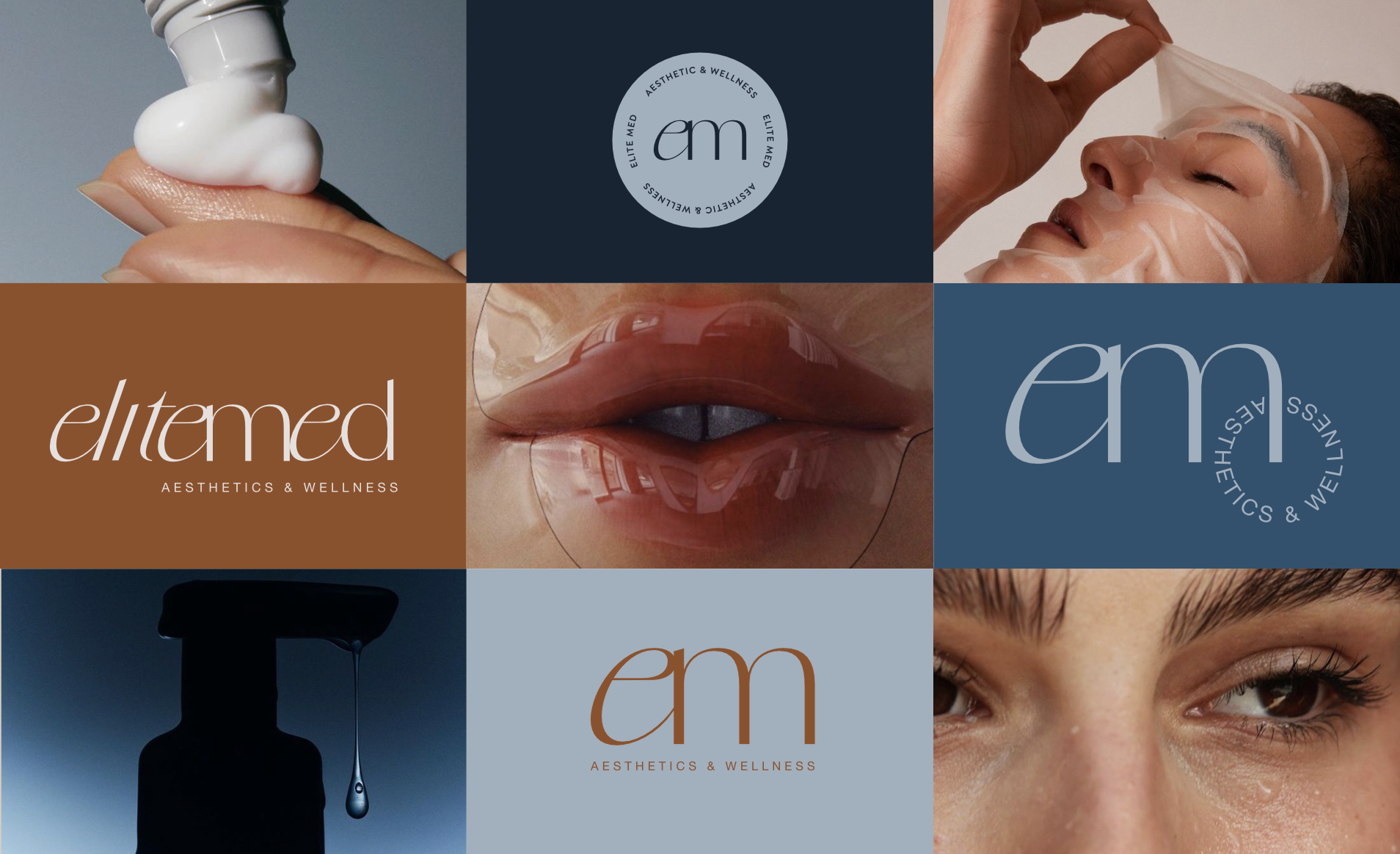
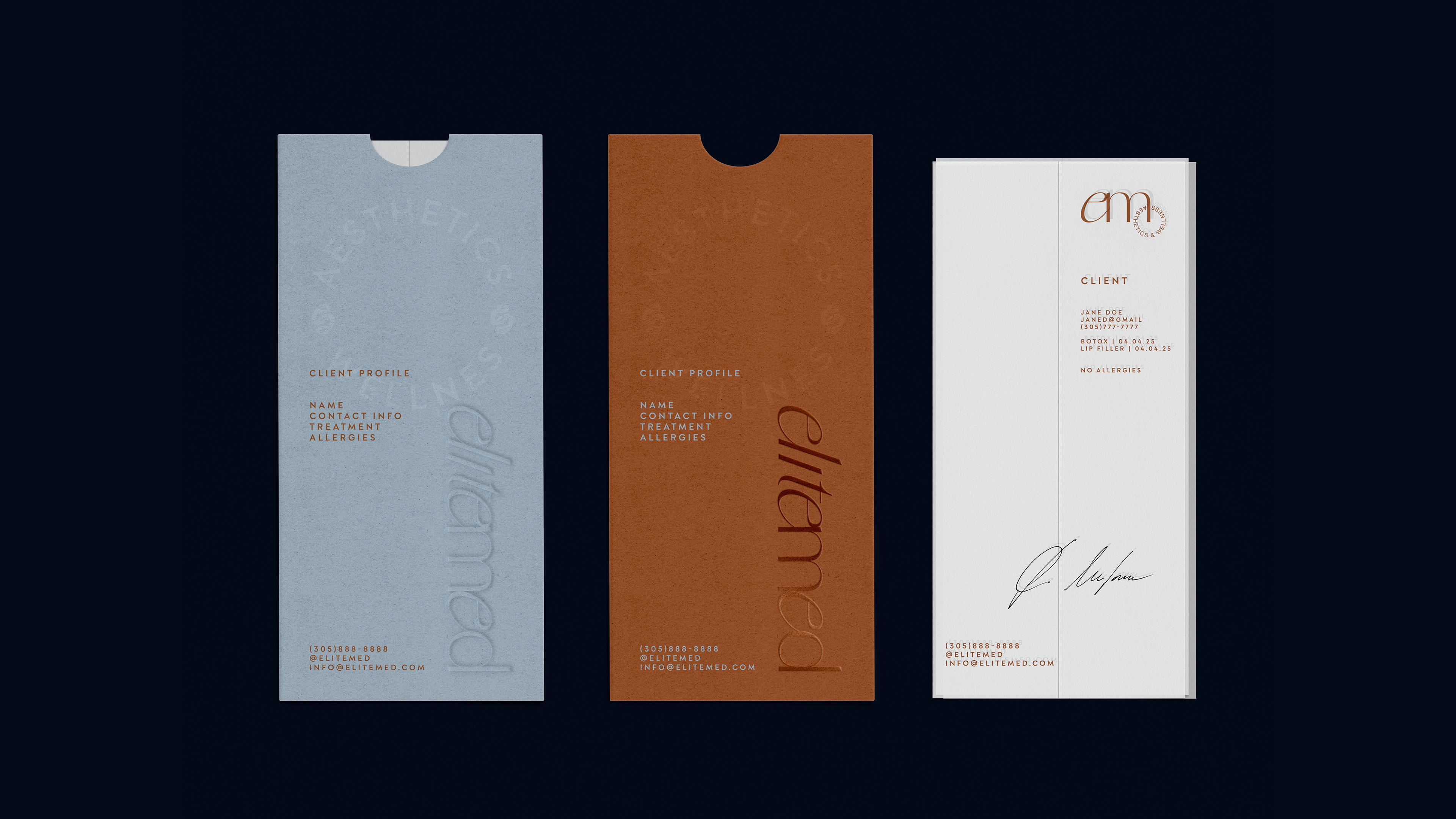
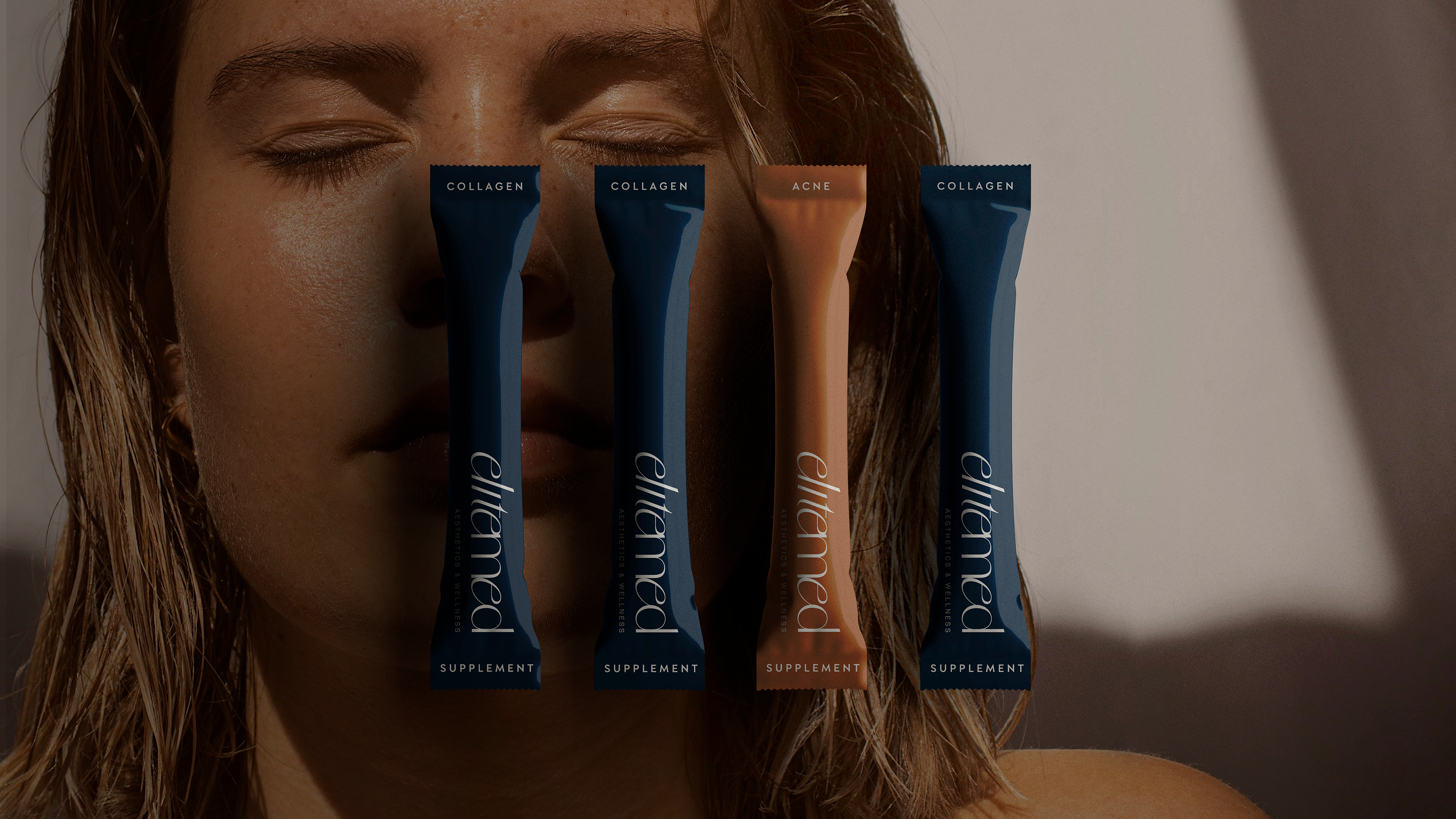
The identity is built on a clean, modern typographic system paired with a warm, grounded color palette. Deep blues and rich earth tones create contrast and depth, while soft neutrals keep the overall look calm and cohesive. Subtle details, like the fluid curves of the logotype and the circular mark, bring a sense of movement and softness to an otherwise structured system. This balance extends across packaging and collateral, where minimal layouts and considered spacing allow the brand to feel confident.
The result is a brand that feels polished, thoughtful, and quietly confident, designed to stand out while maintaining a sense of trust and clarity across every touchpoint.